1. Your site loads too slowly
If your website takes more than three seconds to load, most visitors will leave before they see anything. This is especially true for homeowners browsing on their phone between meetings or during lunch.
How to check: Go to PageSpeed Insights and type in your web address. Google will give you a score and flag exactly what’s slowing things down.Quick fix: The most common culprit is oversized images. Before uploading photos of your work, run them through TinyPNG (free, no account needed) to reduce the file size without affecting quality.
2. Visitors can’t find what they need
If someone lands on your site and can’t immediately see what you do, where you work, and how to contact you, they’ll move on to the next builder. Complicated menus and buried contact details are silent enquiry killers.
How to check: Ask someone who hasn’t seen your site – a mate, anyone – to find your contact details and your list of services. Watch how long it takes them. If they hesitate, you have a problem.
Quick fix: Your main menu should have no more than five items. And a link to your contact page should be clearly visible.
3. Your contact buttons aren’t doing their job
A button that says “Submit” or “Click Here” tells a visitor nothing. It doesn’t give them a reason to act and it doesn’t set an expectation for what happens next.
Quick fix: Change your button text to something specific like “Get a Free Quote” or “Book a Site Visit.” We’ve seen this one change improve the number of people who actually follow through. You don’t need a developer to do this – most website platforms let you edit button text directly.
4. Your site doesn’t work properly on mobile
The majority of people will look at your website on a phone, not a desktop. If your site is hard to navigate on mobile – small text, buttons that are difficult to tap, forms that are fiddly to fill in – you’re losing enquiries every day.
How to check: Open your website on your own phone right now. Can you read the text without zooming in? Can you tap the contact button easily? Can you fill in the enquiry form with one hand? If any of those feel awkward, they’ll feel worse to a client who doesn’t already know you.
Quick fix: Google’s Mobile-Friendly Test will show you exactly how your site performs on mobile and what needs attention.
5. Nothing on your site builds trust
Before a homeowner contacts a builder they’ve never used, they want reassurance. If your site has no photos of completed work or no client reviews you look like a risk – even if your actual work is excellent.
Quick fix: Add at least three to five professional photos of recent projects with at least a one-line description of the job. If past clients have left you a Google review, pull a couple of quotes onto your site. List your licence number and any relevant industry memberships. These things take an afternoon to add and make a significant difference to whether someone picks up the phone.
6. Your content is hard to read
Long blocks of text, industry jargon, and vague descriptions of what you do all work against you. Visitors scan websites – they don’t read them. If the point isn’t obvious in a few seconds, they’re gone.
Quick fix: Read your homepage out loud. If it sounds like a brochure rather than a conversation, rewrite it the way you’d explain your business to someone you just met. Use short paragraphs. Break up longer sections with a clear heading. Lead with what the client gets, not what you do – “We build extensions that families love living in” lands better than “We specialise in residential construction services.”
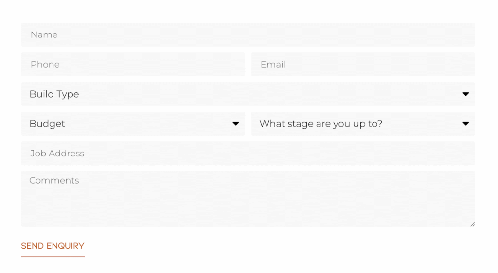
7. Your enquiry form is too complicated
Every extra field you add to a contact form reduces the number of people who complete it. Asking for a preferred start date, a detailed description or whether they own the property before you’ve even spoken to someone is too much friction. A client who is serious about the job will happily share all of that detail once you’re actually talking – but asking for it upfront feels like an interview rather than an invitation.
Quick fix: We also know that one of the biggest frustrations for builders is spending time quoting jobs that were never serious to begin with. That’s why we put a lot of thought into the form layouts we recommend – simple enough that genuine clients will complete it, but structured enough to filter out tyre kickers before you pick up the phone. Here’s what we typically recommend:
Where to start
If all of this feels like a lot, pick one thing. The mobile check and the PageSpeed test are both free and take less than five minutes – start there, and you’ll know quickly whether those are problems worth fixing.
Most of these mistakes are more common than you’d think, and fixing even one or two of them can make a real difference to the number of enquiries you receive. You don’t need to overhaul your entire website overnight.
If you’d like a second set of eyes on your site, that’s exactly what we do at SEE Marketing Studio. We work exclusively with builders and construction businesses, so we know what works and what doesn’t. Get in touch and we’ll take a look.